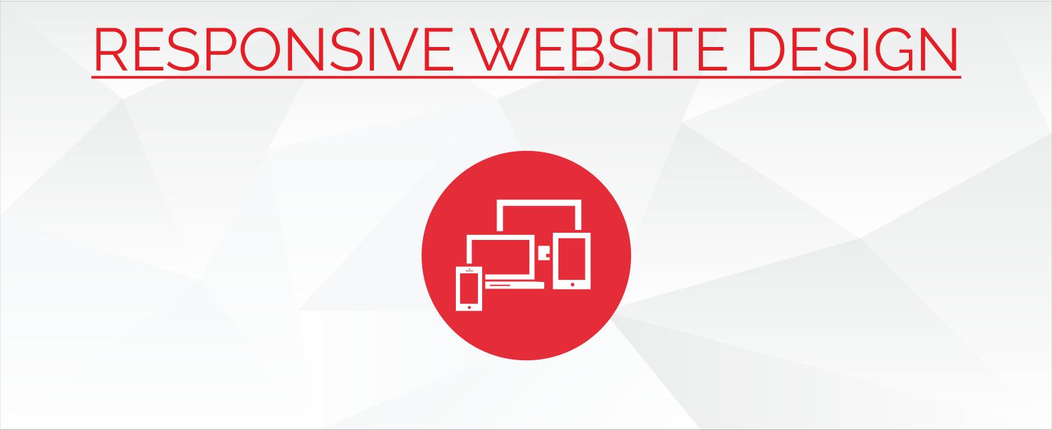
Responsive Website Design (RWD) is the new concept in website design, which proposes to address the ever changing scenario of devices such as browsers, tablets, smart phones and other devices and adjusting to their screen sizes as well as orientations by creating flexible, fluid, as well as adaptive web sites.
Instead of responding to the current needs for a desktop version along with a particular mobile version, Responsive Website Design proposes to resolve the issue the other way around by using flexible and fluid layouts that have the capability to adapt to almost any other screen. The core concepts of RWD revolve around three technical features which are as below:
- Media queries and media query listeners
- Flexible grid based layout which has the capacity to use relative sizing
- Flexible images as well as media with the help of dynamic resizing or even CSS
Hence the website should be compliant not only with a desktop, but be optimized for most tablets as well as smart phones. RIS is a renowned India based web development and design company that has the right mix of web designers and web developers who have sound ability as well as experience in dealing with RWD for its clients who need unusual as well as uncommon solutions for their web development projects.


